Background Information
During the last semester of my Master's program at UBalt, I had to complete a semester-long capstone project. Working alongside UBalt's Center for Entrepreneurship and Innovation, we were assigned to up-and-coming businesses and were tasked with creating a visual brand and guideline.
Working alongside two other classmates, Montse Soto, and Johema Farfan, we were assigned to help Emily Kim and Michael Kora rebrand their new subsidiary, 808 Donuts, a donut shop specializing in mochi donuts.
The Design Process
During the semester, my team and I worked diligently on researching and understanding 808 Donuts. We met with Emily and interviewed her in regard to who her target audience was, what vision she had for her business, what aspects she wants us to keep, and what could be improved/redesigned.
My team and I were then able to determine the problem, audience, competitors, and items of recommendation that could potentially be sold once the company was fully established at the Towson Town Center.
Once we had our primary graphics and logos, we worked to incorporate them into various aspects of the business, such as seasonal logos that would highlight seasonal flavors. We also designed graphic elements that would be used on packaging and merchandise, as seen in our mock-ups and mobile app. We also decided with the app, customers would be more inclined to order ahead, instead of waiting in line, which in turn allows them to gain points. They could later redeem these for rewards.
Logo
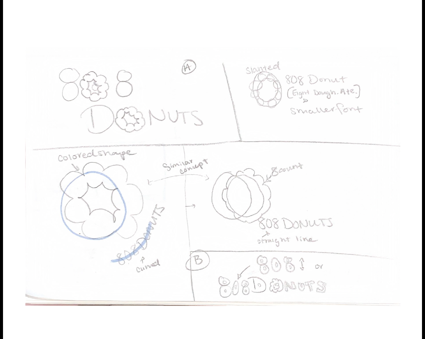
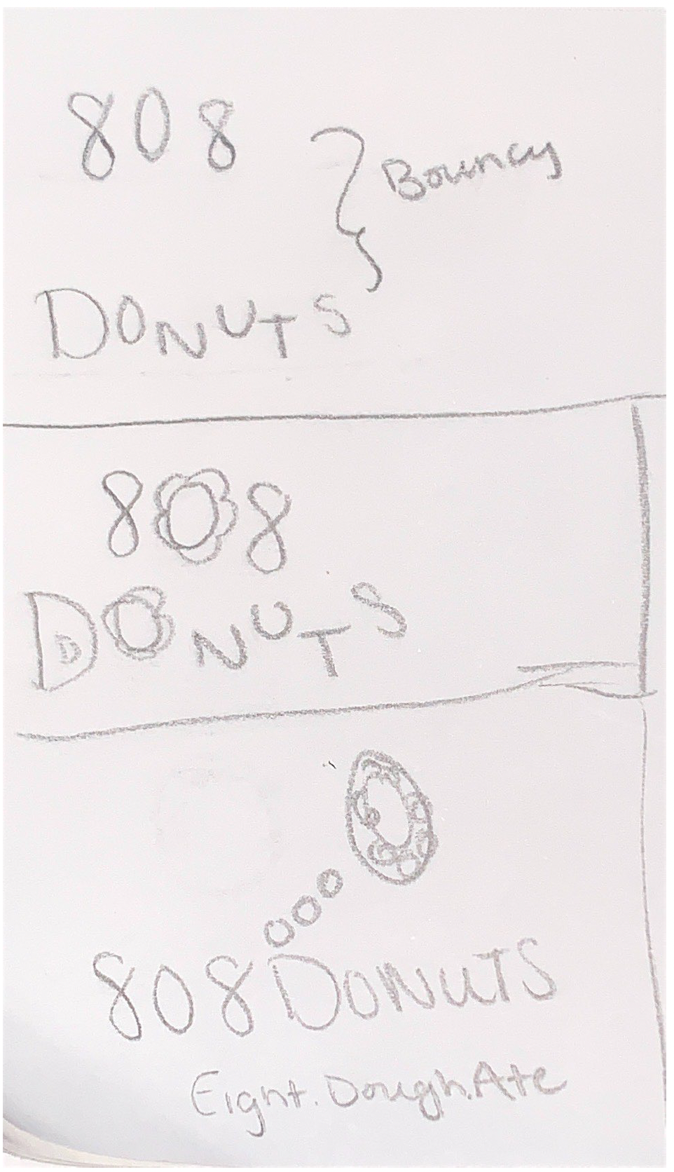
During this process, my teammates and I all sketched out logo ideas. After our team meeting, we voted on which sketches were the strongest, and then proceeded to create a digital design.
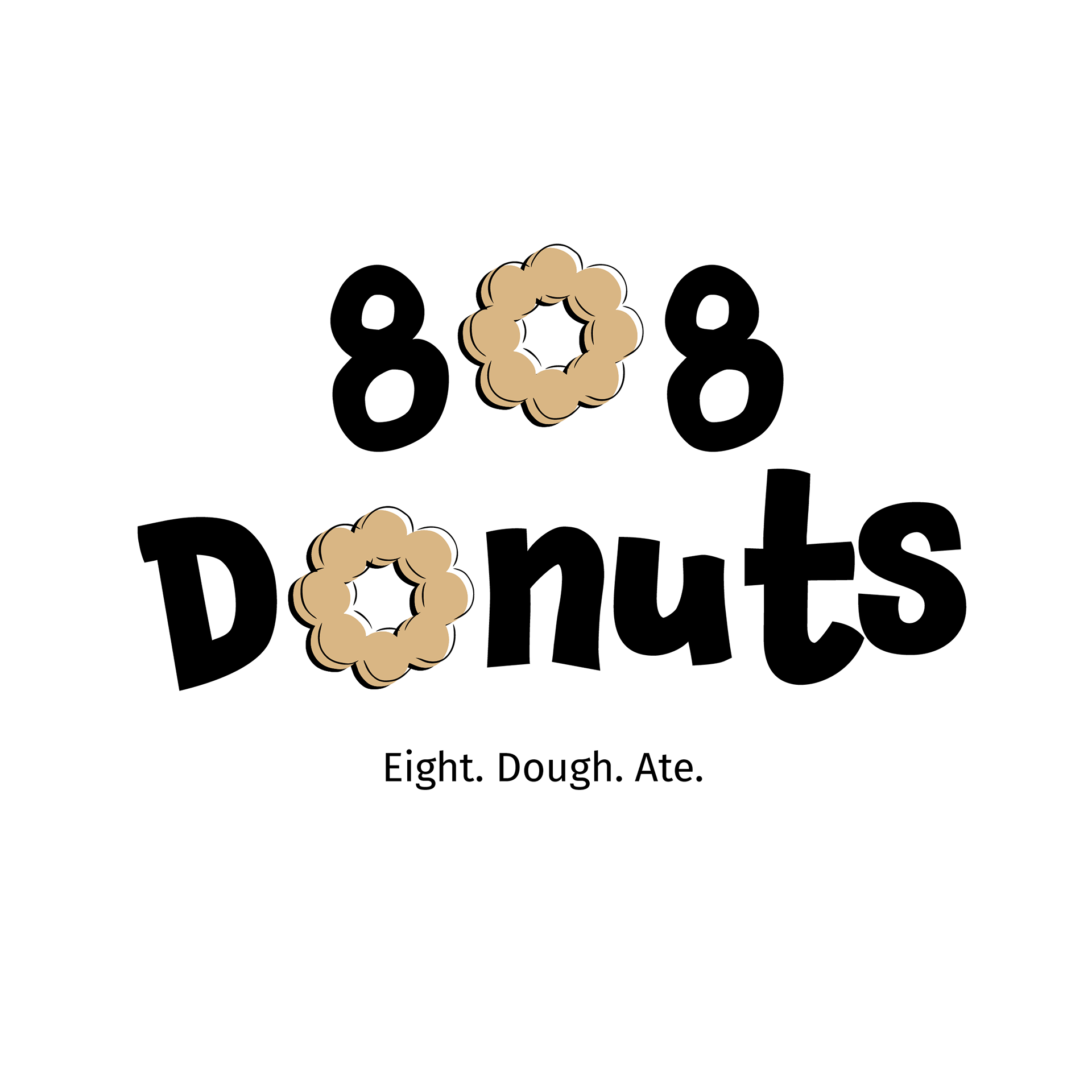
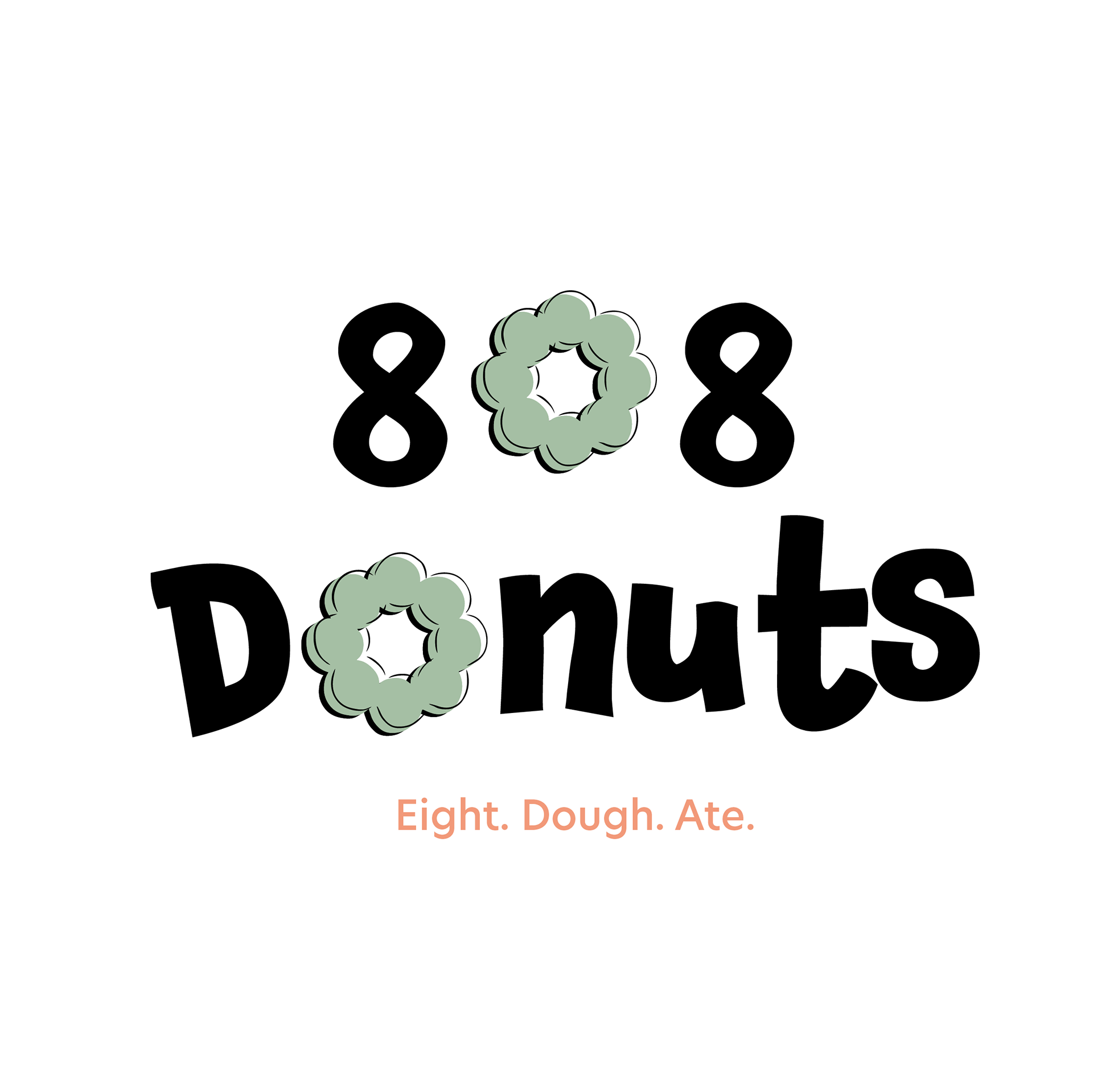
Once we regrouped, we chose to combine elements from each of our logos. The most visible change from my digital sketches to the final logo is the typeface used for the 8's. Montse had found a typeface that still had a bubbly feel to them but was vertical to help with legibility.
We combined both typefaces and decided to change the primary color to green, similar to that of matcha, a popular flavor in East Asian cuisine. See as the client was content with the final outcome, we based the rest of our design work on the logo and flavors they were currently selling and planning to sell.
Prototype
During the design process, I wanted to create an app with an easy-to-use interface that was also minimalistic.
Mochi donuts are vibrant due to the glazes and frosting, so the array of colors would enhance the look and feel of the app, without too many distracting elements.
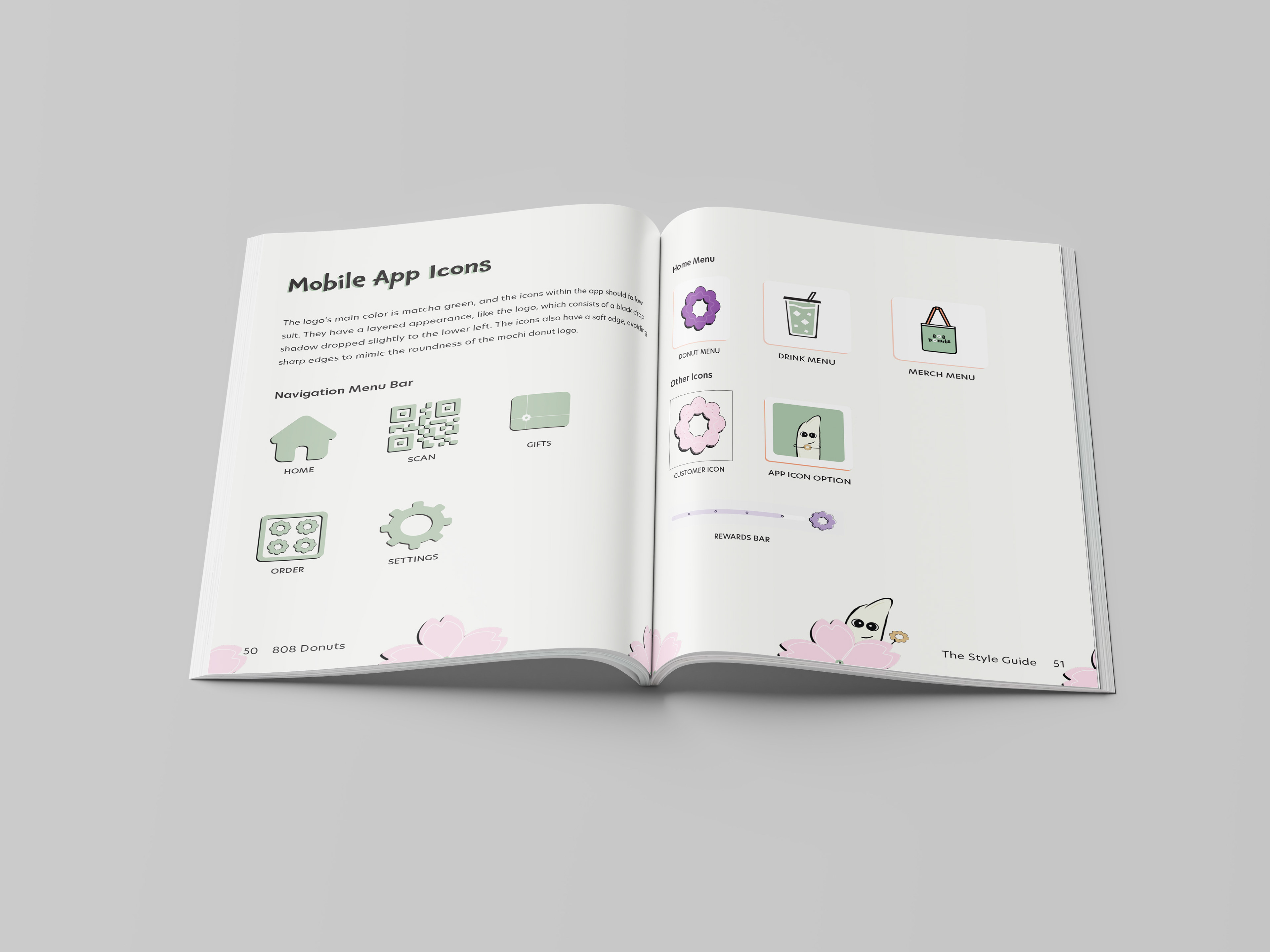
When designing and arranging the icons, I took into account the roundness of the mochi donuts and want to highlight that element throughout the app.
The rounded edges can be found on the navigation bar icons, drinks, merchandise, and app tiles.
Marketing and Advertising
We recommend that the business' main form of communication would be through Instagram. The reason is that it is a fast and simple way to introduce new flavors, post reels, and interact with customers.
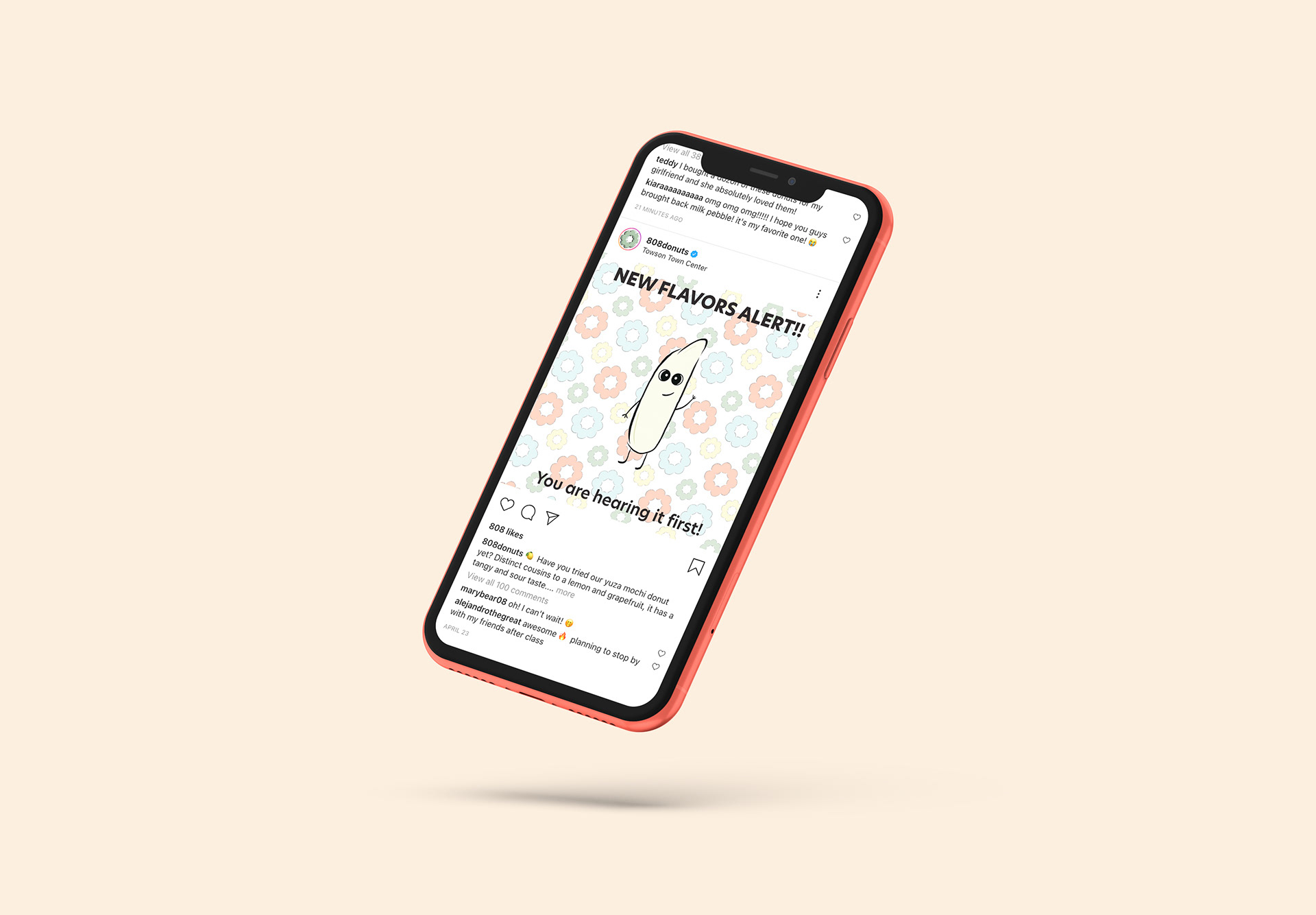
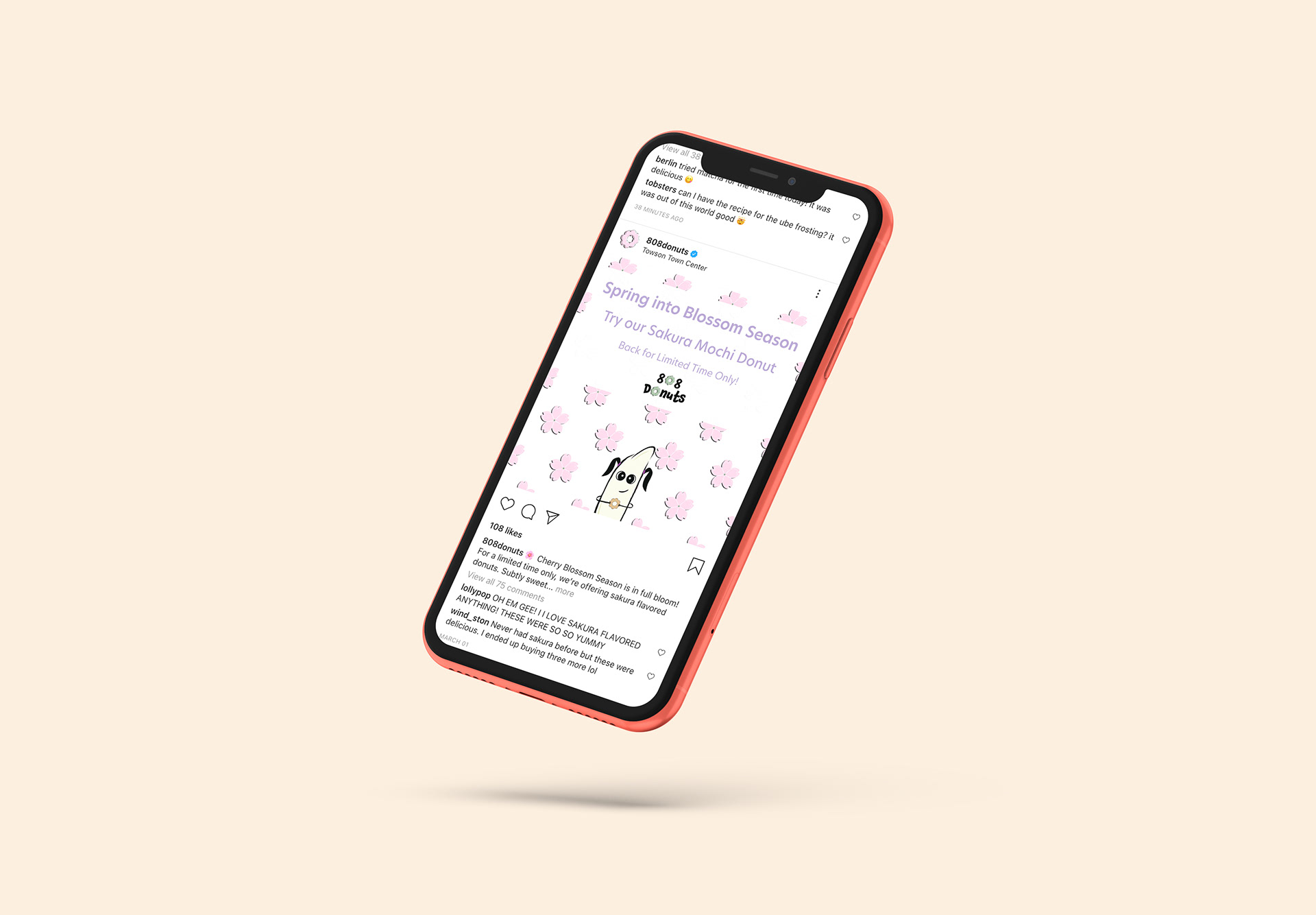
Once my teammates had finished designing flyers, I used them as promotional materials and created an Instagram mock-up. I wrote captions to pair with our flyers. Both were used to announce new flavors that would be introduced every month and a seasonal flavor - Sakura.
On the left-hand side, our logo is our standard matcha green donut. On the right-hand side, our logo has changed to Sakura pink, which is only to be used during the spring, to highlight the cherry blossom festival.
The Completed Project
My teammates and I spent the entire spring semester working on a process and style guide, covering everything from the owners, company, overview, problem, and solution. We also covered the ways in which the logo could and could not be used. We recommend they hire a food photographer, develop an app, and create merchandise such as pins, stickers, tote bags, and most importantly, gift cards.
My Roles
During the duration of this project, I took on several roles such as leader, researcher, graphic designer, prototype, copywriter, and presenter.
As a leader, I started by asking them about their strengths and weakness, to better understand what they were comfortable working on. I also organized our meetings and set goals every week so that we each knew what had to be completed by the time we regrouped. I also encouraged my teammates to speak and share their thoughts and opinions.
We all contributed to the research necessary to help us create a vision for 808 Donuts' rebranding. We started by creating mood boards, which consisted of colors, images, and fonts. We then switched over to researching the history behind mochi donuts, the Towson population, and the competitors in and out of the Towson Town Center - the mall in which they are currently located at.
Once we finally had a finalized logo and sub-marks, such as Bob the mascot, I designed elements such as the Sakura flower patterns, which can be found on the mockups. I also designed the mobile app icons which consisted of a drink, merchandise, and navigation bar, as found on pages 50 and 51 of the style guide. This was later incorporated into the prototype of the mobile app, which we recommended the owners create.
As a copywriter, I wrote the introduction to the company, the history behind mochi donuts, the mission and vision statement, and other information in the process and style guide. I also created marketing materials that would be shared on the company's Instagram page, as found on page 55 of the style guide.
Finally, at the end of the semester, I presented our project to a panel of judges and invitees.
